Justice, Peace, Integrity
of Creation
Justice, Peace, Integrity
of Creation
By John Paul Pezzi, Mccj
Justice, Peace, Integrity
of Creation
By John Paul Pezzi, Mccj
Justice, Peace, Integrity
of Creation
By John Paul Pezzi, Mccj
Justice, Peace, Integrity
of Creation
By John Paul Pezzi, Mccj
World maps have been lying for 400 years
Press-Citron 20.03.2026 Camille Coirault Translated by: Jpic-jp.orgHow can you turn a sphere (the Earth) into a rectangle (a map) without making a mess? Well, you cannot, and Greenland has been benefiting from this for more than 400 years, creating a persistent geographical illusion.
Greenland suffers from a serious case of the frog that wants to be as big as the ox. When you look at it on Google Maps, it parades with all the grandeur of a continent, appearing almost as large as the whole of Africa. Yet this is nothing more than a vast geometrical trick that has endured since 1569.
With its 2.1 million km², the island is indeed the largest in the world (excluding continents), but in reality it is 14 times smaller than the African continent. If this cartographic “lie” still persists today, it is because of (or thanks to, depending on your point of view) one of the greatest cartographers and geographers in history: Gerardus Mercator. Here is the explanation.
Greenland: the 404 error of world cartography
The culprit behind this cartographic bug is therefore a Flemish genius of the 16th century who simply wanted to help sailors avoid ending up at the bottom of the Atlantic Ocean during their expeditions. Gerardus Mercator found himself facing a serious puzzle: how to represent the Earth on a flat surface when it is (almost) spherical? Navigators needed a map, which was far more practical to use than a bulky globe impossible to place on a navigation table.
To understand this, imagine trying to flatten an orange peel: it will tear. To avoid such tears and keep a neat rectangular map, Mercator had to cheat. He stretched the map horizontally so that the meridians (which normally meet at the poles) became parallel lines.
But to prevent the continents from looking squashed, he had to apply a proportional vertical stretching. This is what is called a conformal projection: it preserves angles and the shape of coastlines, but completely sacrifices real surface areas. It has since borne his name: The Mercator projection.
However, no projection can be perfect, as stated by Gauss’s remarkable theorem (Theorema egregium), which explains that it is mathematically impossible to represent the Earth without distortion. In the case of the Mercator projection, the further one moves away from the equator, the more the stretching coefficient increases exponentially. At the poles, the distortion tends almost towards infinity: Greenland ends up looking inflated on steroids, while Africa, located on the equator, remains at its true size.
Why did this bug become a global standard?
That is the million-dollar question. Why do we still use a map designed for Renaissance sailing galleons on our ultra-connected smartphones? Simply for visual comfort.
The Mercator projection became the hegemonic standard in the 19th century because it preserves the shape of countries; we have therefore been conditioned to see the world this way. Yet there are countless alternatives. The Gall-Peters projection, for example, faithfully preserves surface areas (so Africa appears enormous), but stretches continents vertically, giving them a distorted appearance. It also suffers from many flaws, and the visual estimation of proximity between two countries becomes completely inaccurate.
There is also the Robinson projection, a compromise used by National Geographic, or Equal Earth, the new favourite among geographers who want to decolonise our maps. In reality, there are hundreds of others (we will not list them here, at the risk of turning this article into a directory), but today we are completely prisoners of Mercator’s projection.
Yet, as Fritz Kessler, professor of geography at Pennsylvania State University and a specialist in projections, points out, the choice of a map should not be automatic. We should not forget that modern cartography was born out of military needs, and that even today a map remains a tool far from neutral. “Is it intended to measure distances? Angles? Areas? Or to show the distribution of thematic data such as population?” Kessler asks.
Each need has its own projection.
By continuing to use Mercator’s projection, we accept seeing the world through the distorting prism of a Renaissance navigator who had little concern for the real surface area of the Democratic Republic of Congo or Brazil.
The perfect map does not exist, and even the most powerful technology in the world cannot change that. Every two-dimensional representation of our planet is a political act that favours one point of view over another. It is impossible to flatten a sphere without cheating with physical reality: this is the original sin of cartography. If the Mercator projection is criticised today in some circles, particularly for its Eurocentrism, one could argue that this is an easy accusation: without Mercator, the continents would probably never have been connected to one another. Even if perfection does not exist, we should give credit where it is due: his projection remains today the most convenient and visually comfortable for the human mind.
Yes, Greenland is far too big on our world maps, but at least it is not flattened like a pancake or hanging like a wet sock.
In conclusion, we know that Greenland appears disproportionately large on maps because of the Mercator projection, which distorts surface areas. However, this projection, adopted for its practicality, prioritises the shape of continents over their real size. And despite existing alternatives, the Mercator projection remains the standard in modern cartography, influencing our perception of the world.
See, Les cartes du monde mentent depuis 400 ans sur le Groenland : une illusion géographique tenace
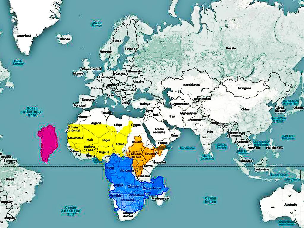
Photo. Do you see this small pink island to the west of Africa? This is the real size of Greenland. © Screenshot / thetruesize.com
 My friends, I am going to tell you a story that speaks to the heart, a story like clear water flowing gently through the soul, a lesson for a joyful life.
Once upon a time, there lived side by [...]
My friends, I am going to tell you a story that speaks to the heart, a story like clear water flowing gently through the soul, a lesson for a joyful life.
Once upon a time, there lived side by [...]  Let us listen carefully—both with intellect and discernment—to the story of the mwelele tree (a species of Ficus sycomorus) and the blind men in search of an elephant, for it is truly [...]
  If I were to ask God for a gift, a single gift, a heavenly gift, I would ask Him, I believe without hesitation, to grant me the supreme art of the smile. It is what I most envy in certain people. It [...]
  After many, many years spent alone, walking alone, singing alone and eating alone, Nasilele became bored with her loneliness and, one day, said to Nyambe: “I feel very sad and always feel like [...]
  Contemporary African art is experiencing a period of significant international visibility, with artists reshaping the global landscape and bringing new perspectives, histories and identities from the [...]
 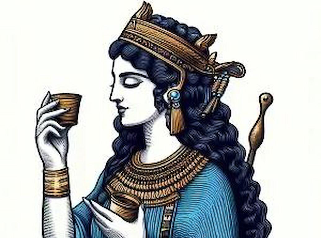 Long overshadowed by the canonical figures of the Western tradition, Enheduanna is nevertheless the first known author in history. More than 4,000 years ago, in Mesopotamia, this high priestess [...]
  “Sidi”, he said, “could you advance me some money for my next crop, which promises to be very good? I will then be able to buy some tea, some sugar and a few yards of cotton cloth [...]
 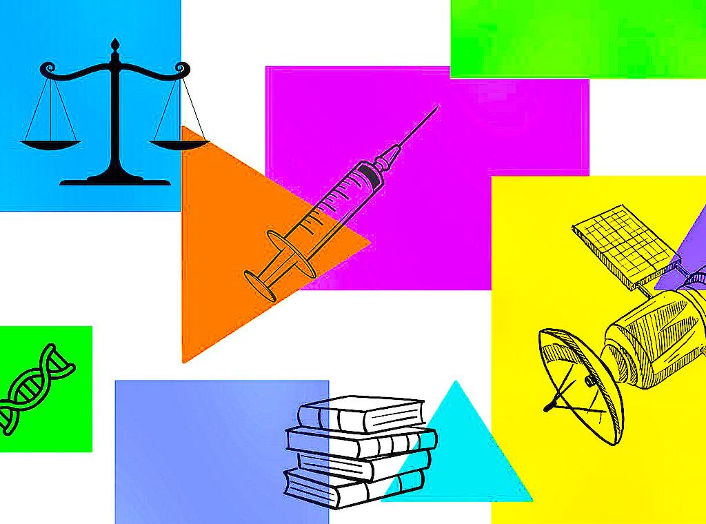 The twenty-first century has just reached its silver anniversary. At first glance, it is marked by several negative headlines: the attack on the Twin Towers, multiple economic crises, wars across the [...]
  “No one has ever seen death’s face. No one has ever heard its voice. Yet, cruel as it is, death breaks men.” Inscribed on cuneiform clay tablets around 2150 BC, the Epic of [...]
 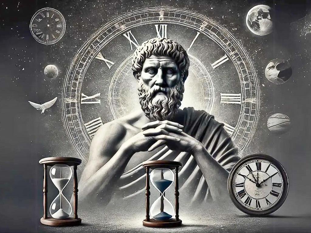 Continue to act thus, my dear Lucilius — set yourself free for your own sake; gather and save your time, which till lately has been forced from you, or filched away, or has merely slipped from [...]
 Info
Email: jampypezzi@gmail.com - tel. +39 328 732 6990 / +243 991 457 856
This blog is made in 4 languages: it en fr es

 EDitt | Web Agency
Leave a comment